
Reinventing the phone (app)
The visual philosophy of making a phone call
History
The Phone app has always held a privileged place on the iPhone. "The killer app is making calls" said Steve Jobs in 2007, a simple yet revelatory statement during a time when the majority of phones were shockingly difficult to master. Putting calls at the center of the iPhone experience was necessary for Apple to demonstrate just how wrong they thought other phone makers had gotten it.

iPhoneOS 3
Now largely unchanged for over 13 years, the Phone app has continued to be a special, blessed app that can do things no other app – third- or first-party – can do. It is the sole tool for making and taking phone calls, listening to voicemails, and managing recent calls. When the original iPhone was introduced the lack of third-party apps, let alone development tools, obfuscated this specialness.

iOS 13
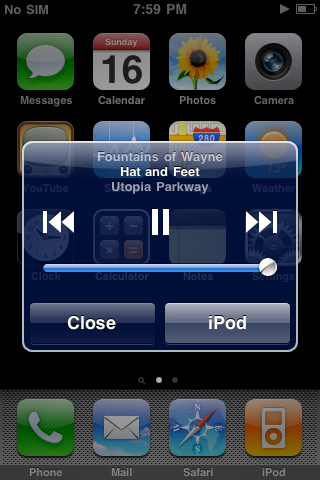
In a way, every app on the first iPhone had special privileges. Remember: there were no notifications, but the Text app (later, Messages) could throw up system-wide modal alerts when you got a new SMS. There was no multitasking, but the iPod app could play music in the background and be controlled with a double-tap of the home button (with another, very different modal pop up). There was no background refresh, but the Phone app could take over your entire screen with an incoming call. Additionally Stocks and Weather were arbitrarily considered "widgets", not apps. In these early days it was difficult to tell what was a system-level feature, and what was simply part of the apps themselves.
As iOS grew, many of these special behaviors would be replaced with full APIs. Notifications. Background audio. Even VOIP apps can piggyback on some of the Phone app's behavior. And it won’t be until iOS 14 when the full-screen incoming call UI will get reduced to a compact notification-like overlay.
But nonetheless the Phone app remains special. And in a way it has to. With over a hundred years of history tied to it, the telephone remains unique in culture and technology. Even similar, popular VOIP services have failed to replace it.
A communications dashboard
There's something to be said for the Phone app's simple, timeless design. For over a dozen years, billions of users have used the app with ease. Any changes would need to have strong reasoning behind them.
On the flip side, allowing the Phone app to remain nearly unchanged for so long could be leaving opportunities for advancement on the table. So in the interest of spurring that conversation, I've taken some time to imagine what an updated Phone app could be.
Goals
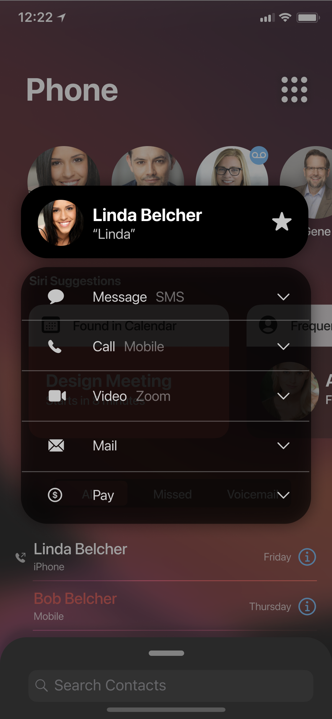
Remove the tab bar
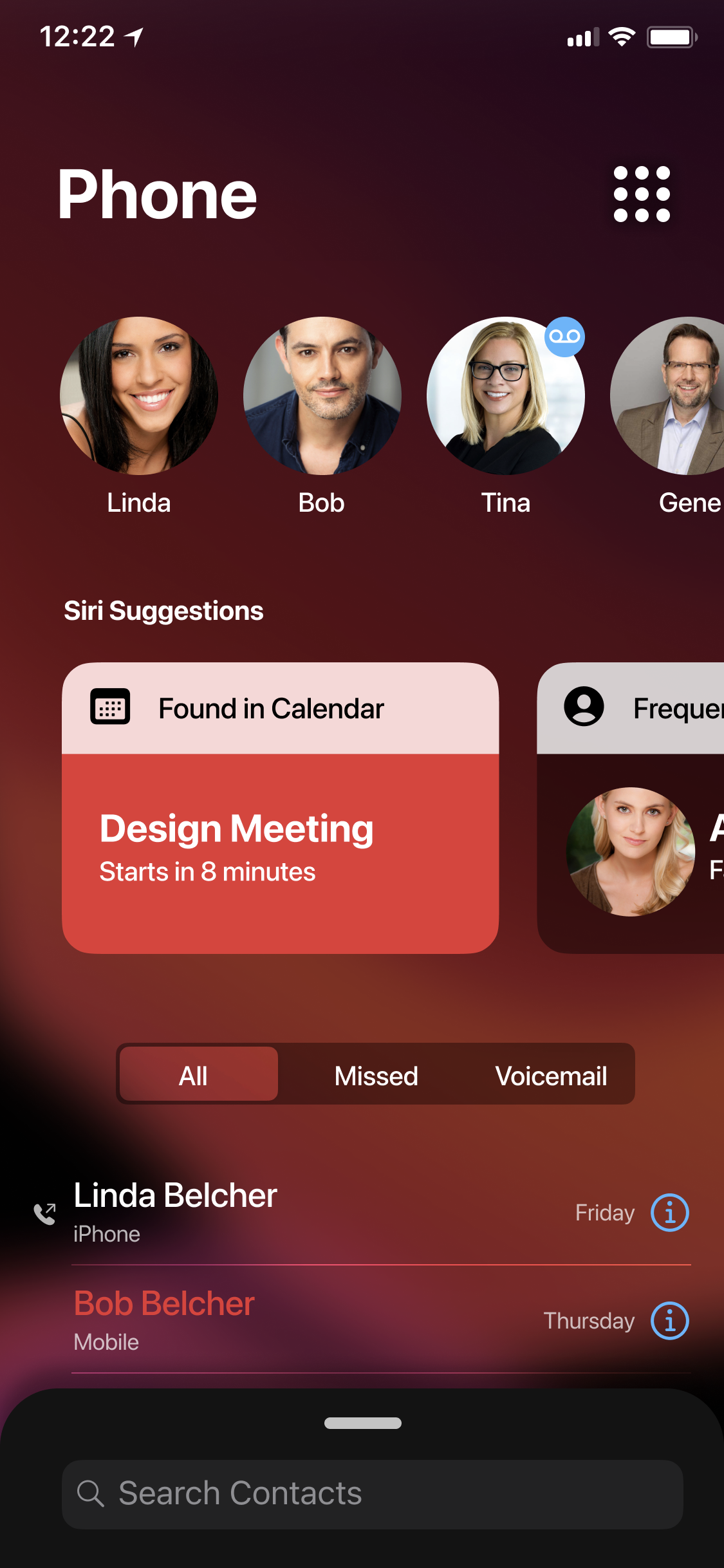
The existing Phone app's tabs each serve an important role, but depending on what you're looking to achieve, you may find yourself visiting multiple tabs to complete your task. Missed a call that left a voicemail? You're visiting two tabs (if you want to properly clear those badges). So I wanted to explore the idea that the Phone app can be your communications dashboard. On one screen you can see your top Favorites, suggested calls, and recents without a second tap. Contacts and the number pad are still just one gesture away.
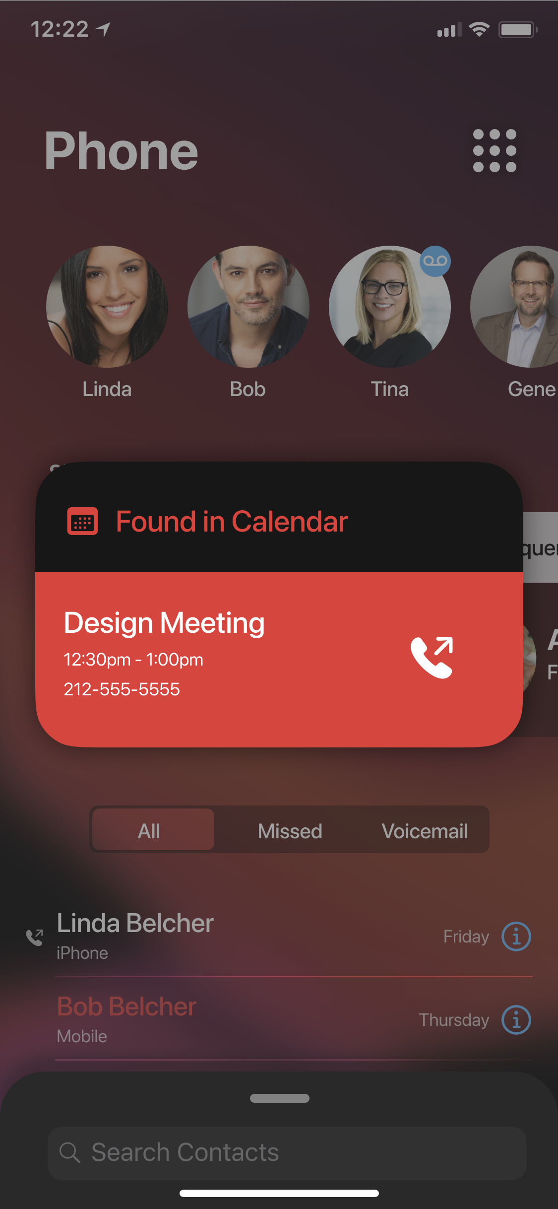
Integrate suggestions
Siri already suggests calls based on activity in other apps. But the regularity with which these suggestions appear on the lock screen or Notification Center is a bit hit-or-miss. By giving them their own position in the Phone app, it elevates the functionality and removes the guessing game as to whether or not it'll show up on your lock screen.
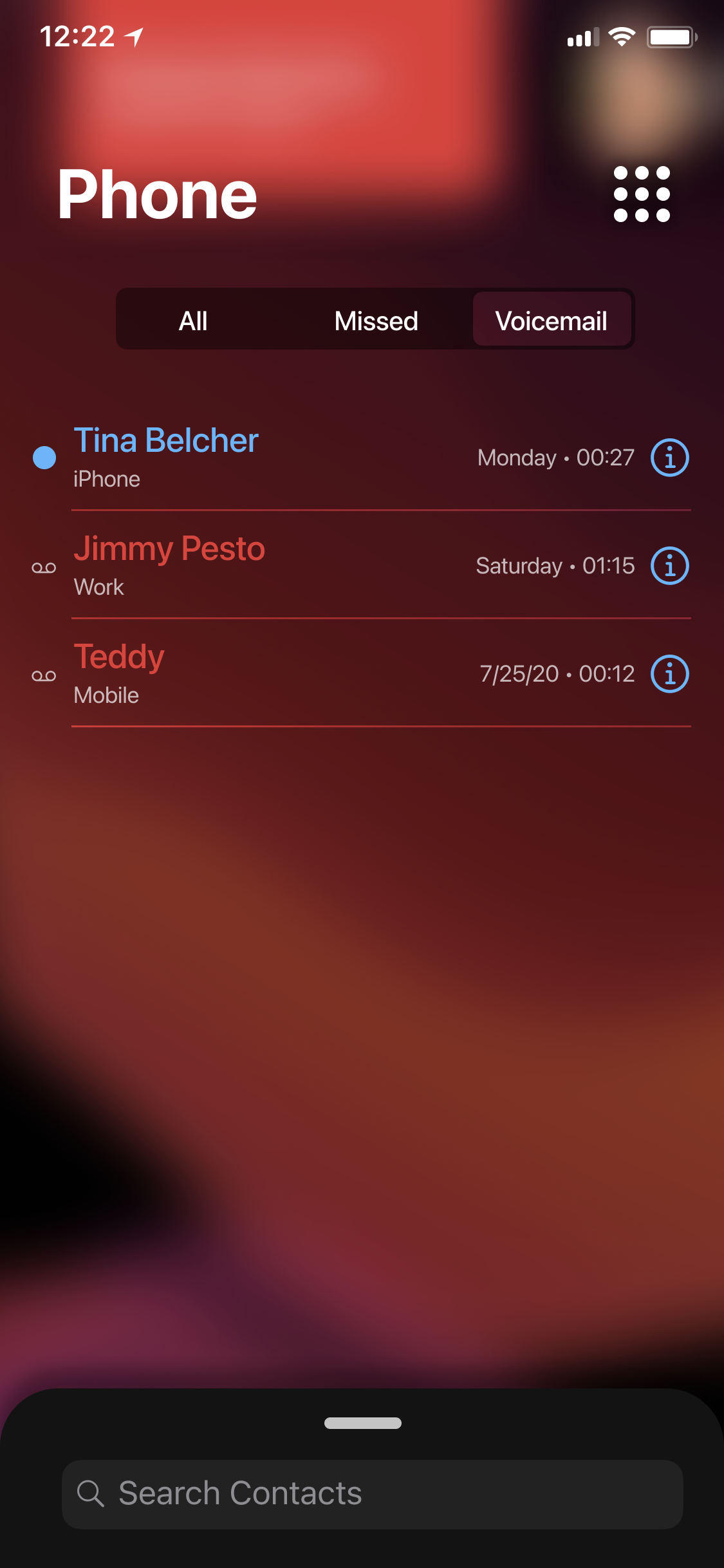
Voicemails are just a type of missed call

Is it possible to get a Voicemail without missing a call? Maybe? I'm not a telecom engineer, but I don't think I've ever encountered this situation. The existing Phone app treats missed calls and Voicemails as separate events – even though the Voicemail was born out of the missed call. I think there is an opportunity to simplify and clarify that relationship.
Recents should act as a filter
Since Voicemails can now be brought under the umbrella of Recents, we can now expand the existing UI for viewing those calls. The segmented control at the top allows us to progressively filter down through All calls (incoming, outgoing, missed, and Voicemail), Missed (including Voicemail), and finally Voicemails by themselves.
Keep what works
There's actually very little that's new in this proposed layout. The Favorites section mimics what shows up in the existing Phone widget. Siri Suggestions have been around for years; this just gives them a home rather than hoping they'll show up in Notification Center. The Recents list merely absorbs the visually-similar Voicemail list. And the number pad and Contacts UIs change very little as well.
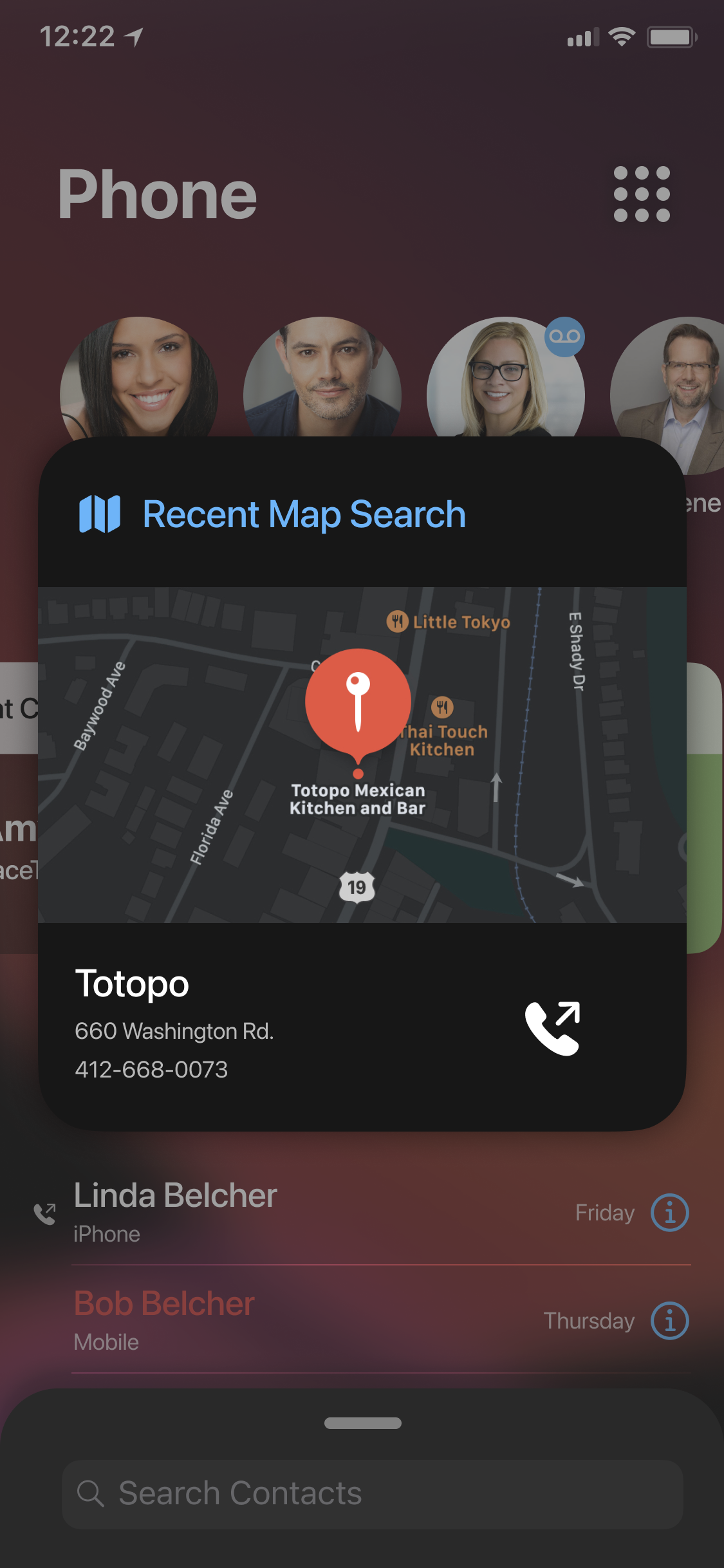
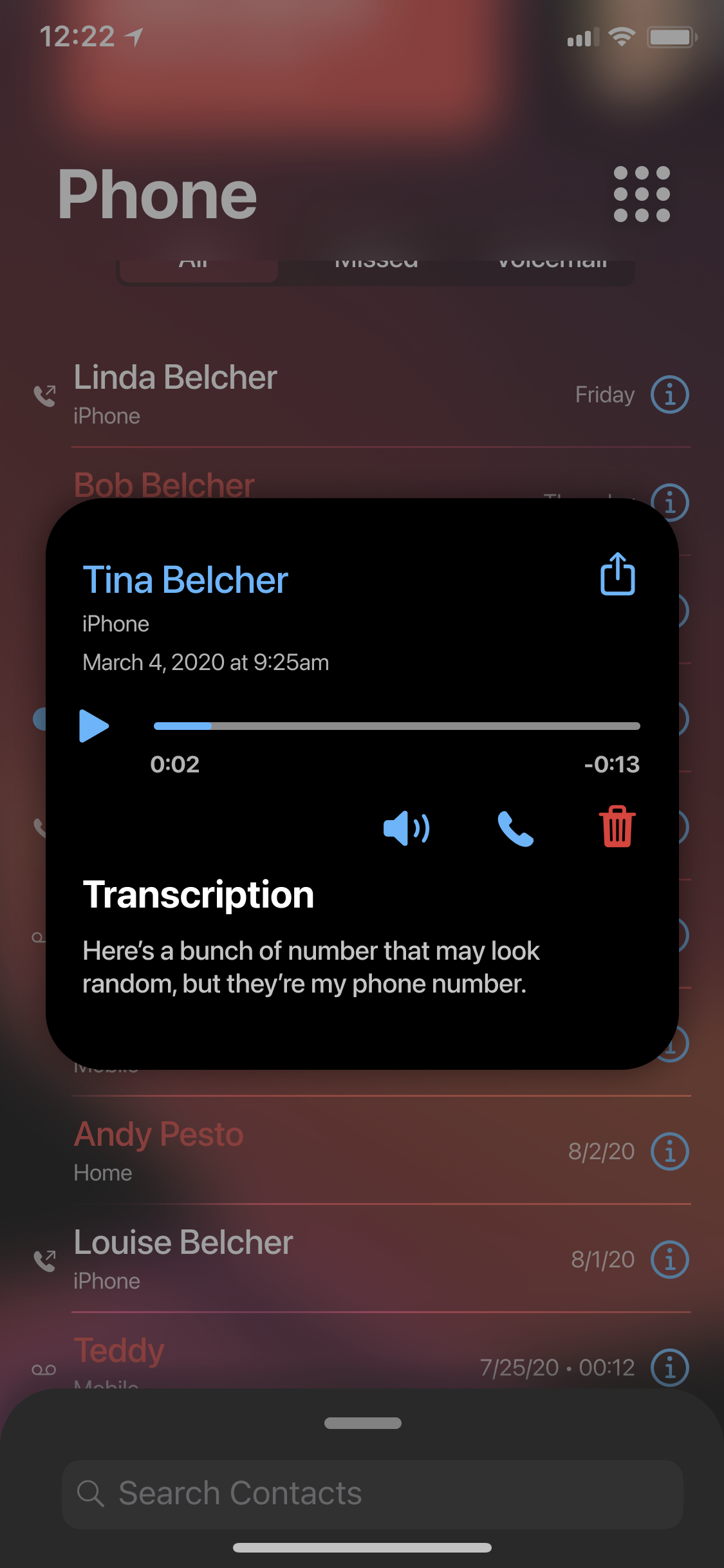
Additionally, there are lots of opportunities to add quality-of-life improvements. Did you get a Voicemail from a Favorite? Why not badge that Favorite? Who the call is from is arguably more important than when it arrived. Additionally: contact cards, voicemails and other elements appear as overlays. This keeps your place within the overall dashboard.
Regressions and possible issues
This concept is a lot busier than the existing app. And different. As I mentioned above, the existing Phone app is beautiful in its simplicity. It uses almost all standard controls with very little custom UI.
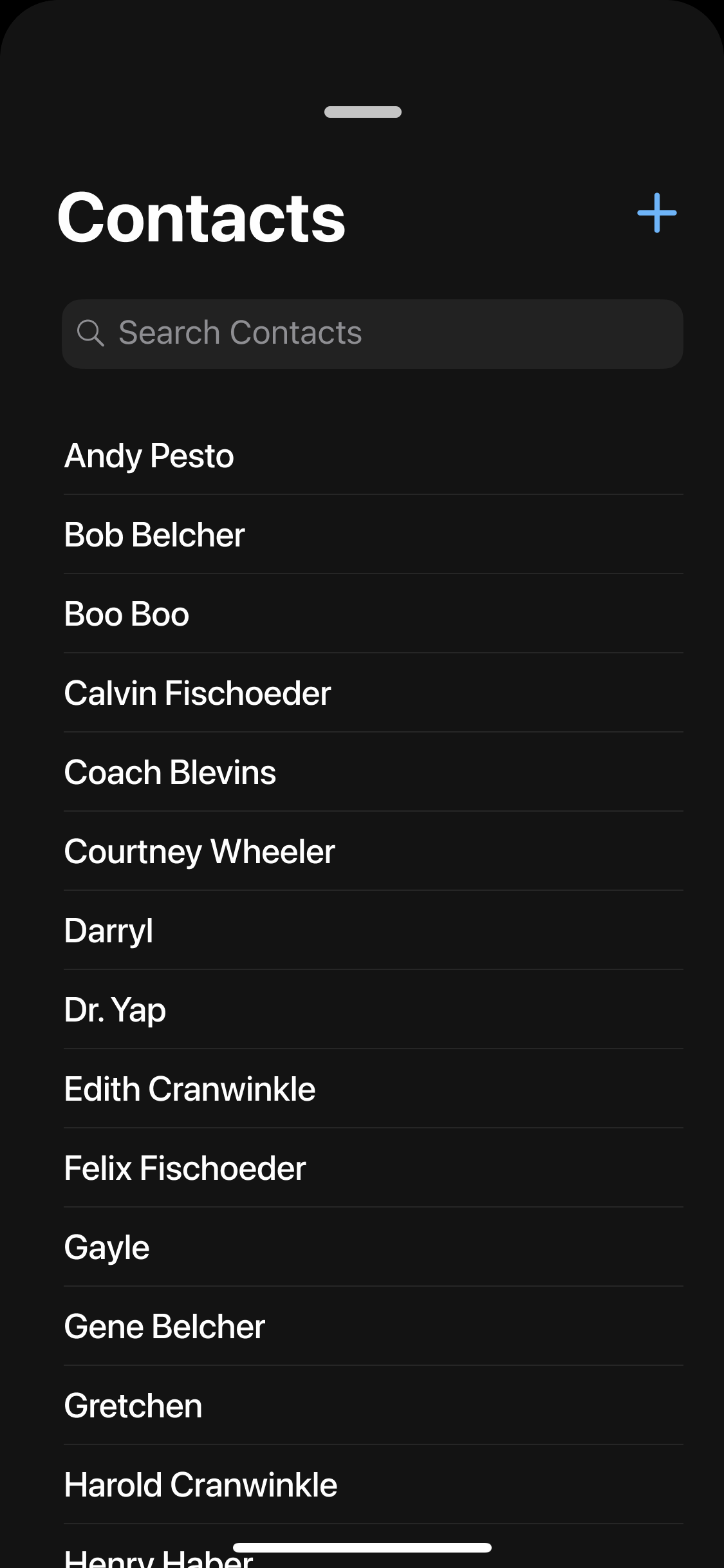
I think relegating Contacts to a drawer is a possible UX problem. Moving this to a button or maybe pagination could be a better solution. Interestingly, Apple already ships a standalone Contacts app - which more-or-less is a mirror of the the Contacts tab in the Phone app. I'd be curious to know their reasoning behind this. It's not like the Contacts app does more (like heaven-forbid manage Groups).
Information density is another area I think warrants discussion. For example: in my mockup, the Favorites section limits you to four initially-visible items before you must scroll. The existing Favorites tab shows 10 items on an iPhone X-class screen. By that measure my design is worse. But I really don't agree with this popular obsession over using every possible pica of screen real estate for content (see: complaints about Big Sur). These are pixels on screens, not a turn-of-the-last-century newspaper. We can afford generous margins. As long as content is discoverable and reasonably accessible, I think there are good arguments for white space, padding, and progressive disclosure.
All this being said, I have no doubt that if anything even approaching my mockup were to be shipped there would be a lot of contentious debate over its supposed merits. But I think there's value in that debate, and in explorations like this. Android both benefits and suffers from allowing third-party SMS and dialer apps. Developers have had an opportunity to explore different approaches on that platform. Apple, for better or worse, hit a proverbial home run 13 years ago and has been endlessly circling the bases ever since.