Let's Fix OmniFocus

The Challenges of Multi-platform design


Editorial note, May 2021: This article was originally published in October 2020. The Omni Group has since previewed their upcoming release of OmniFocus 4, due out later in 2021.

There are few developers that have as rich of a history as The Omni Group; with a product line that can trace its roots back to the earliest days of Mac OS X, Rhapsody, and even NeXTSTEP.

Omni's focus on products and platforms for which they clearly have a passion in turn engenders a lot of the same passion and love from their userbase. And when you consider that many of their products are pro-grade, best-of-class examples in each of their categories, you end up with not just passionate users, but demanding ones. This means any significant changes that Omni makes risk alienating those users – who trust and demand the most from these tools. It's the classic "Adobe" issue: Never remove, only add.

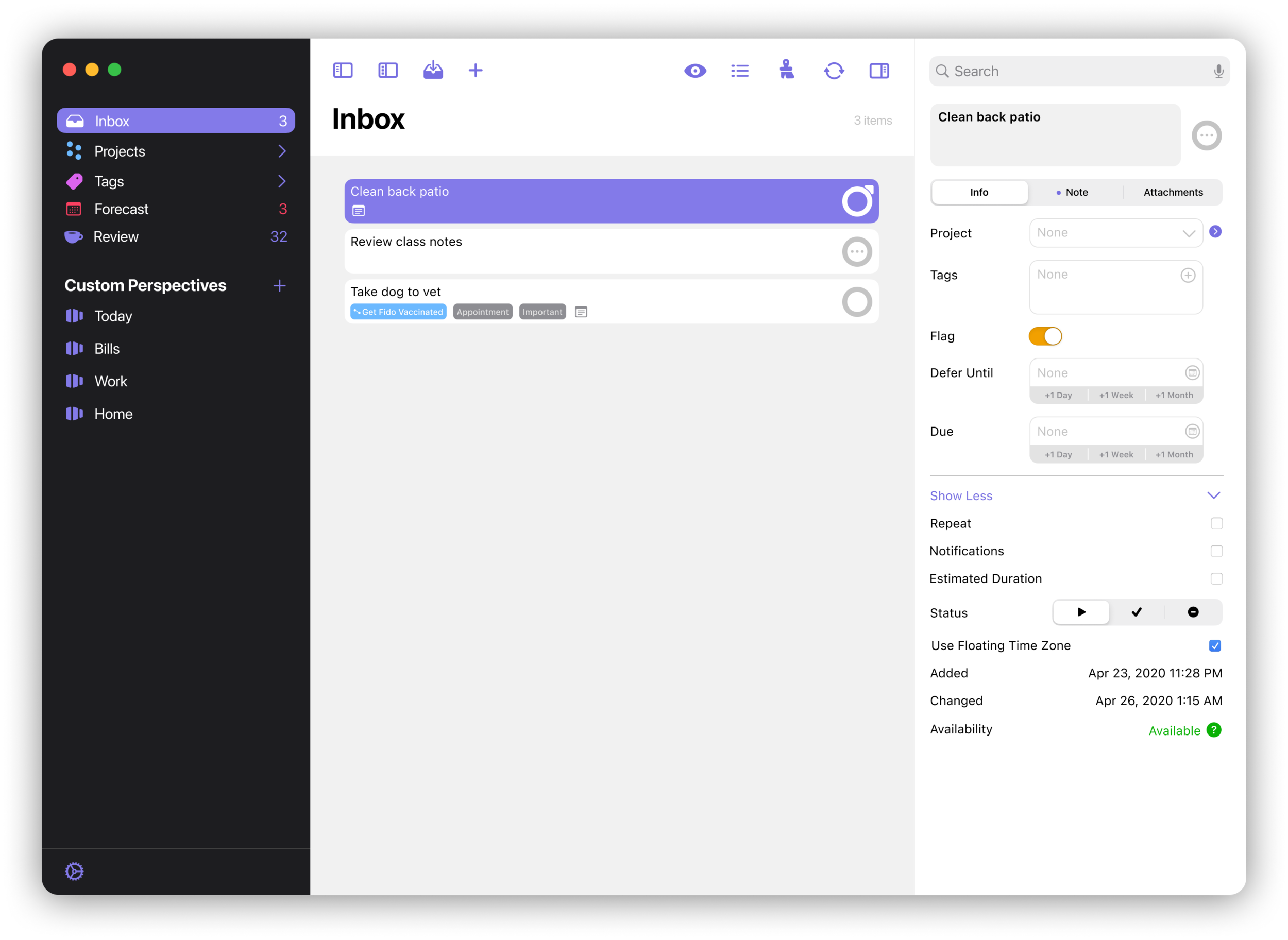
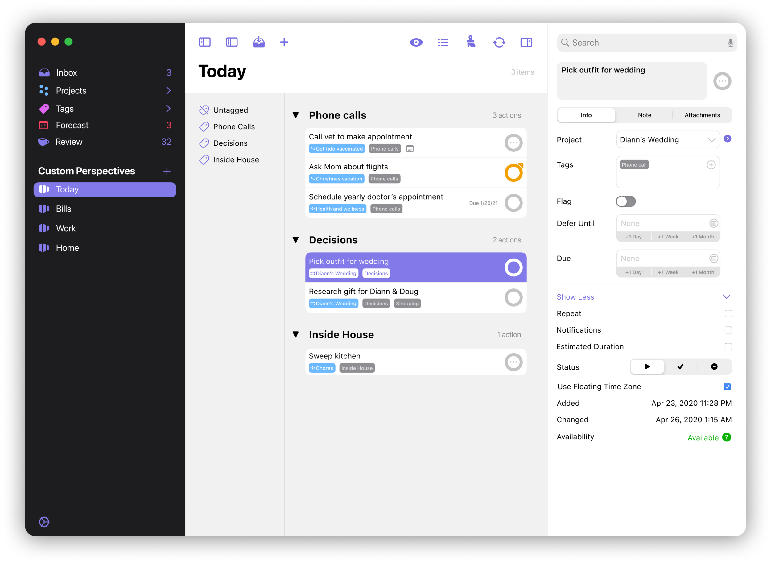
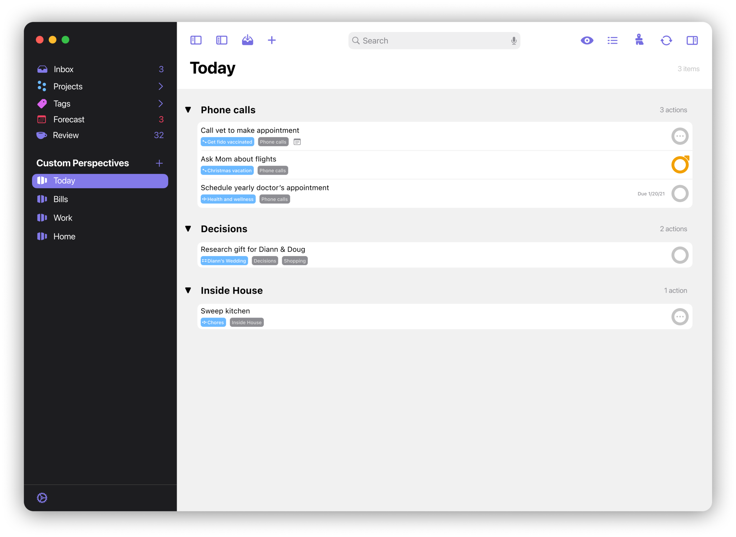
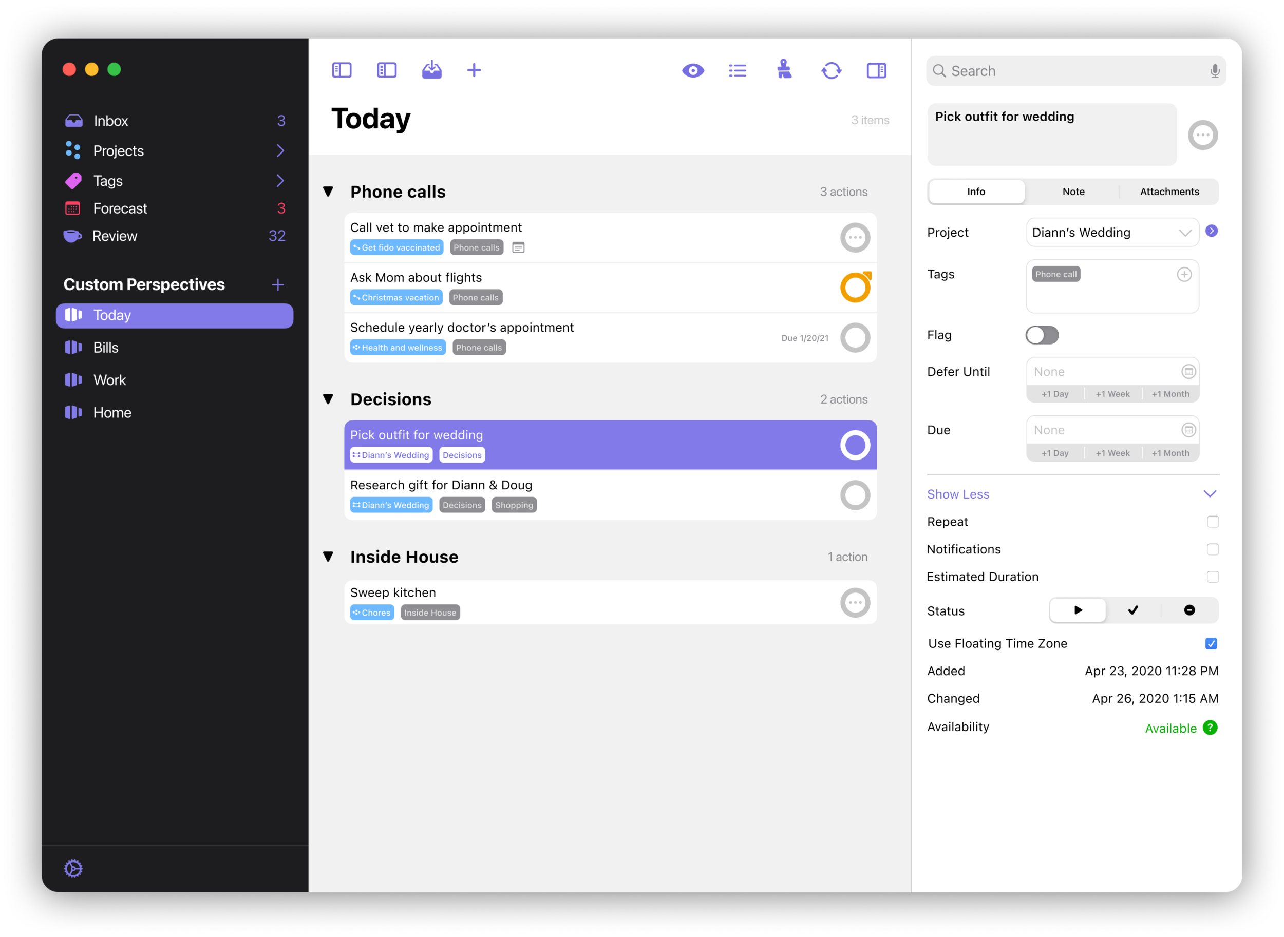
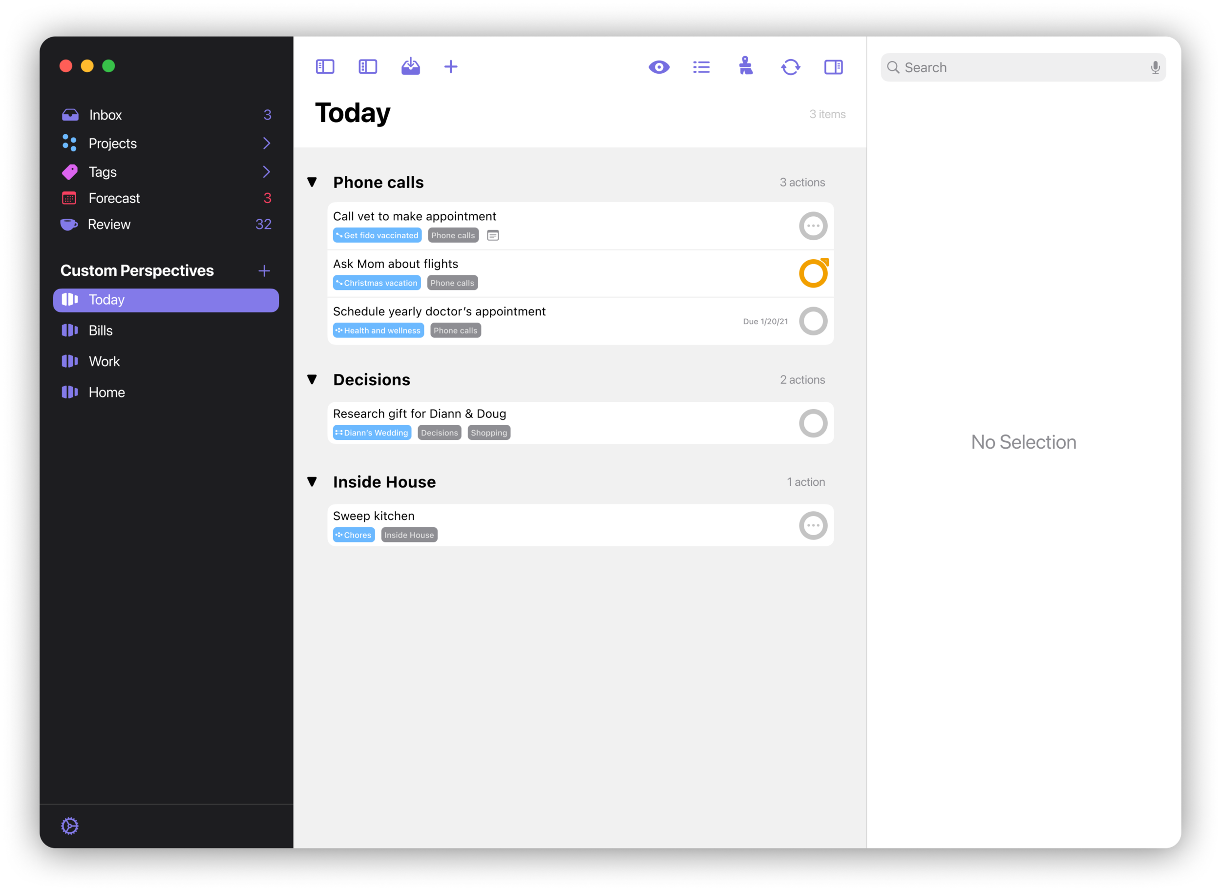
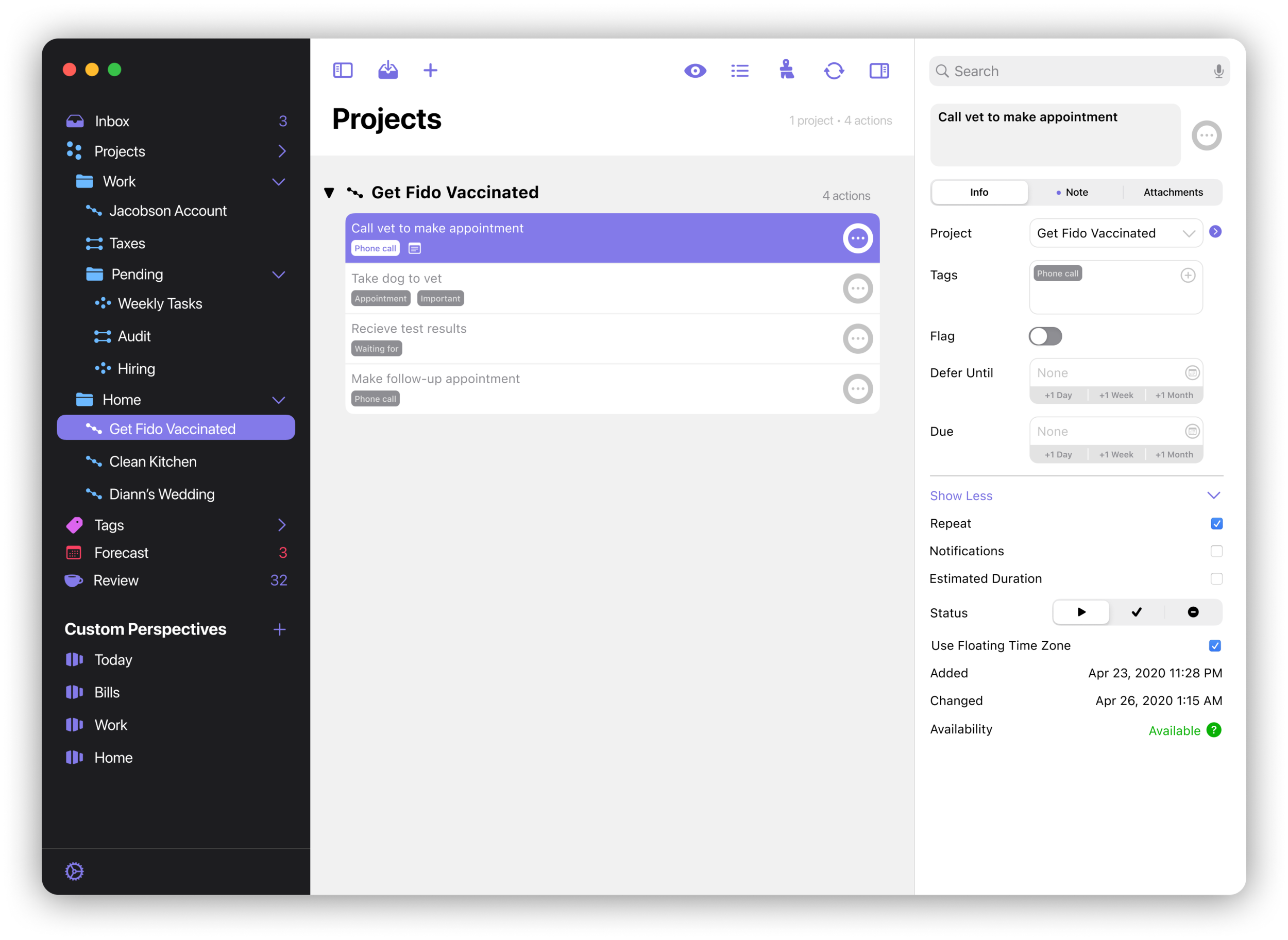
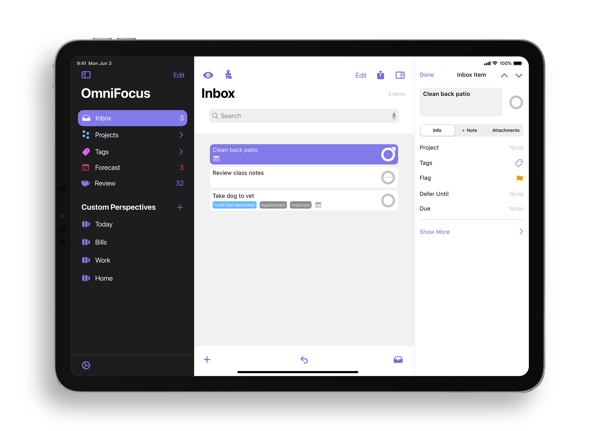
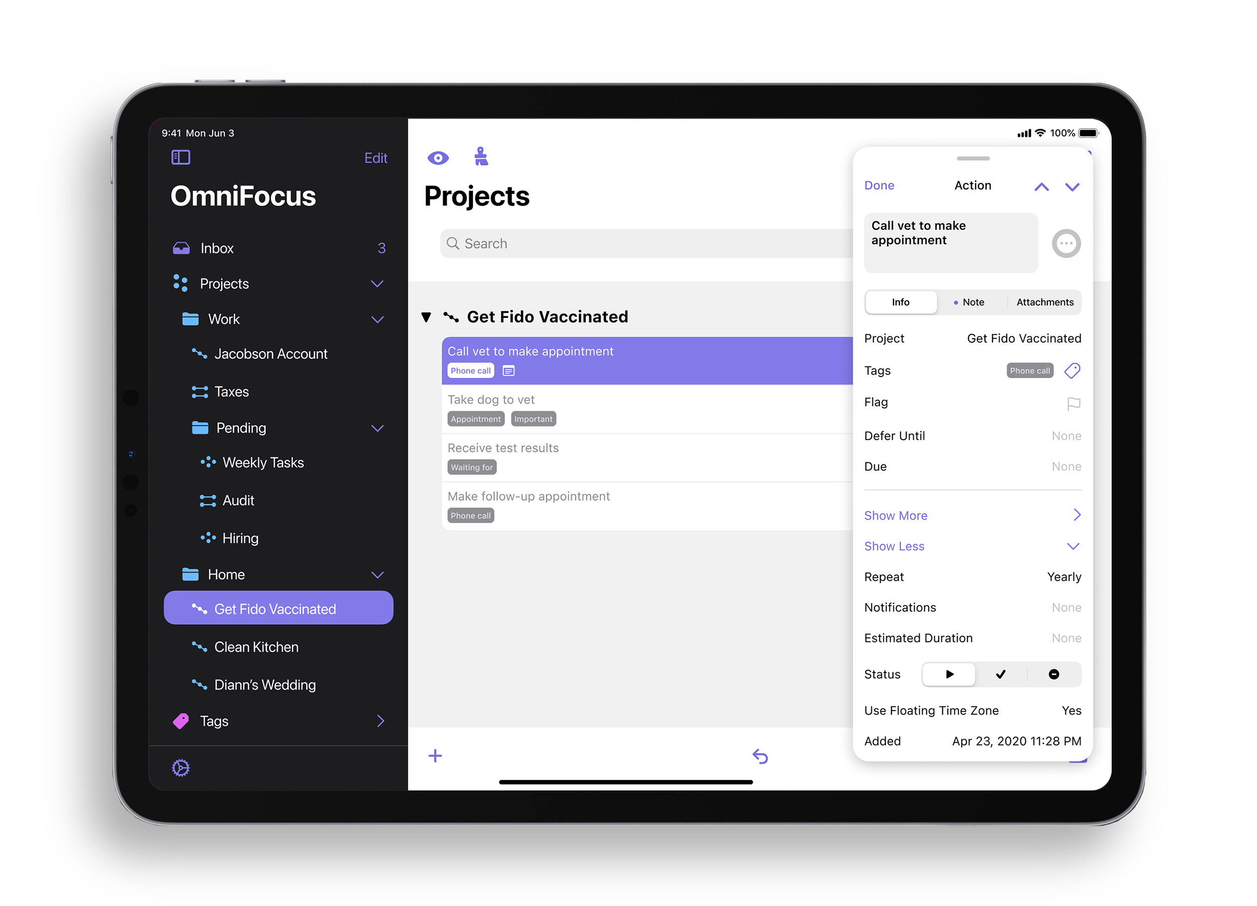
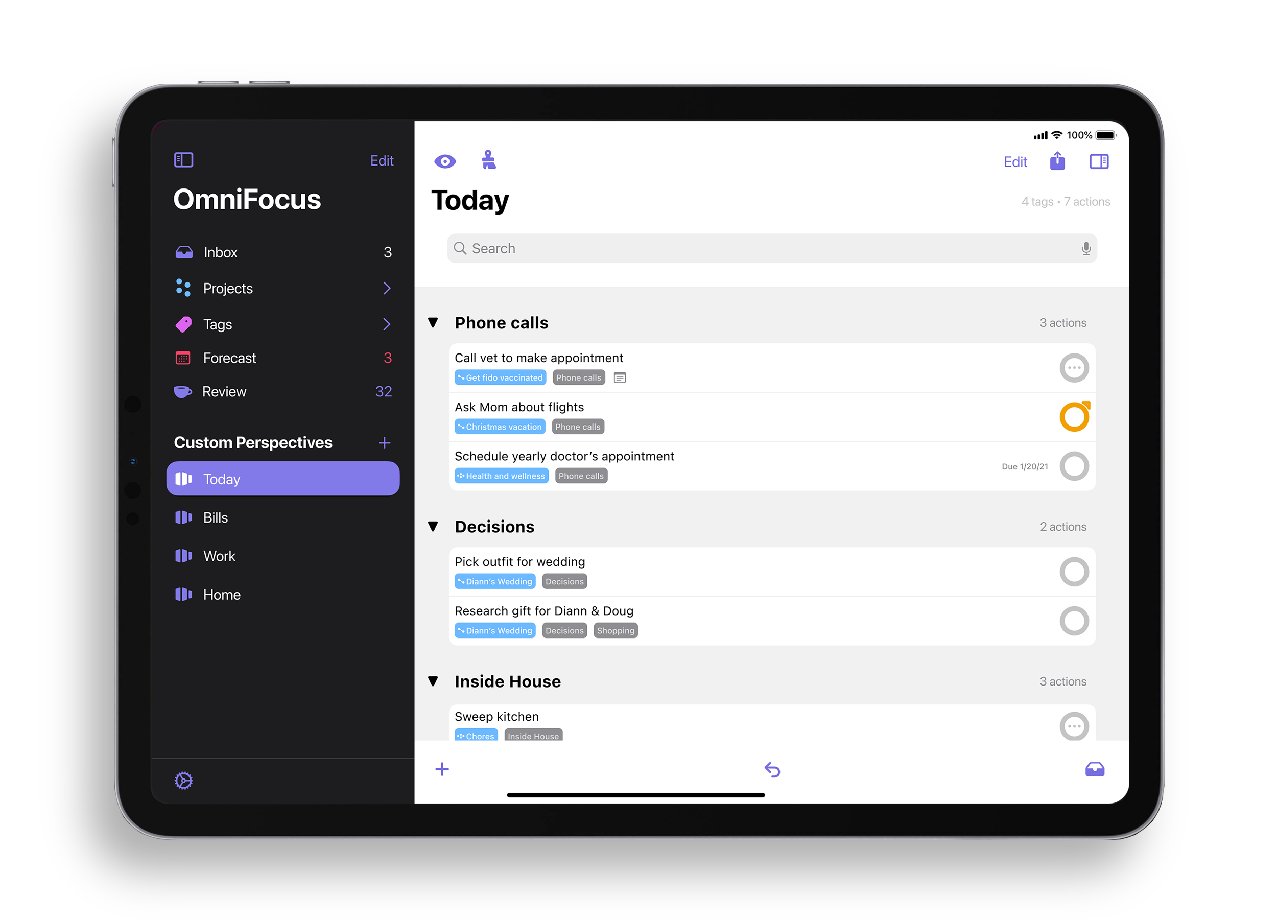
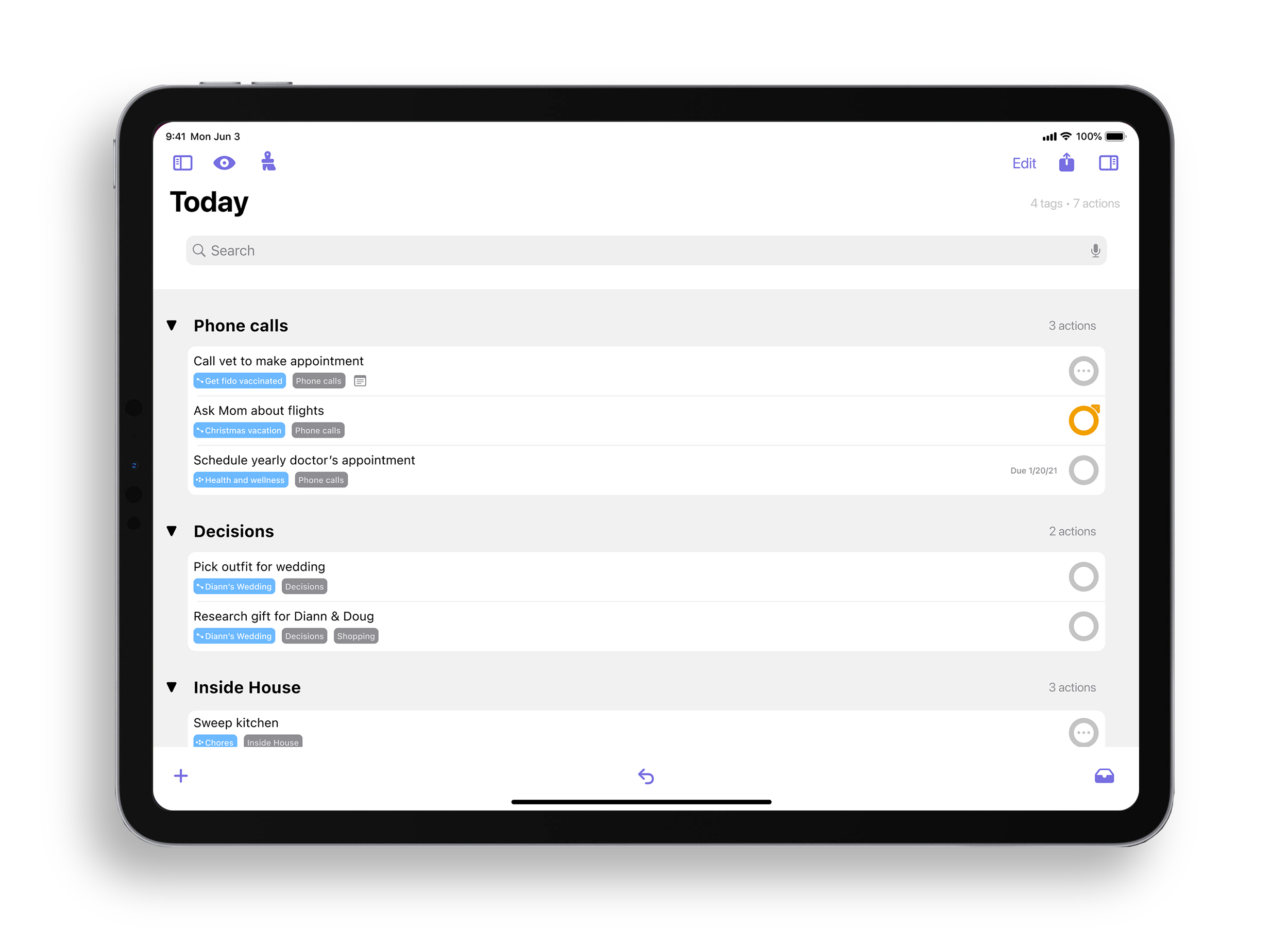
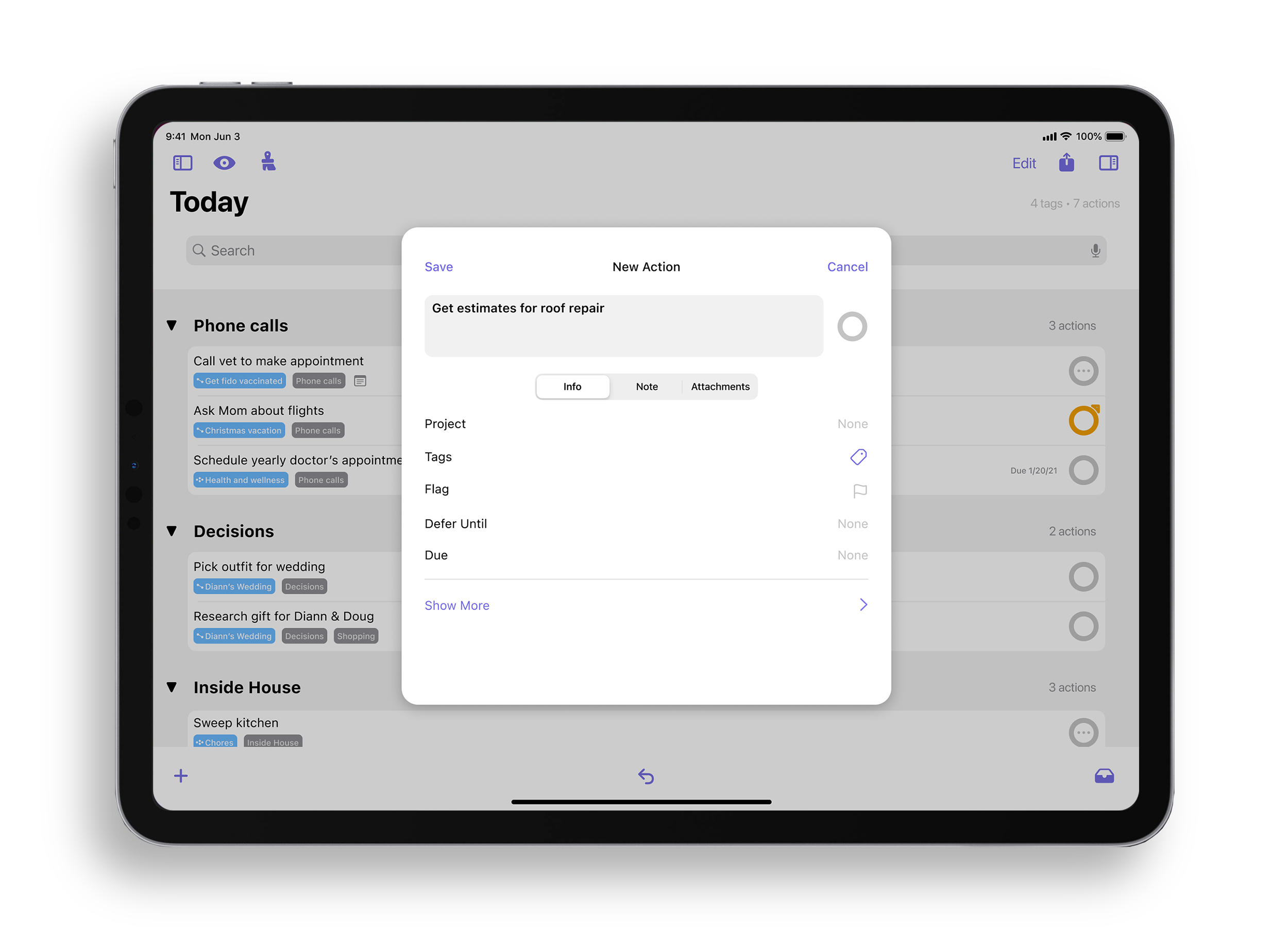
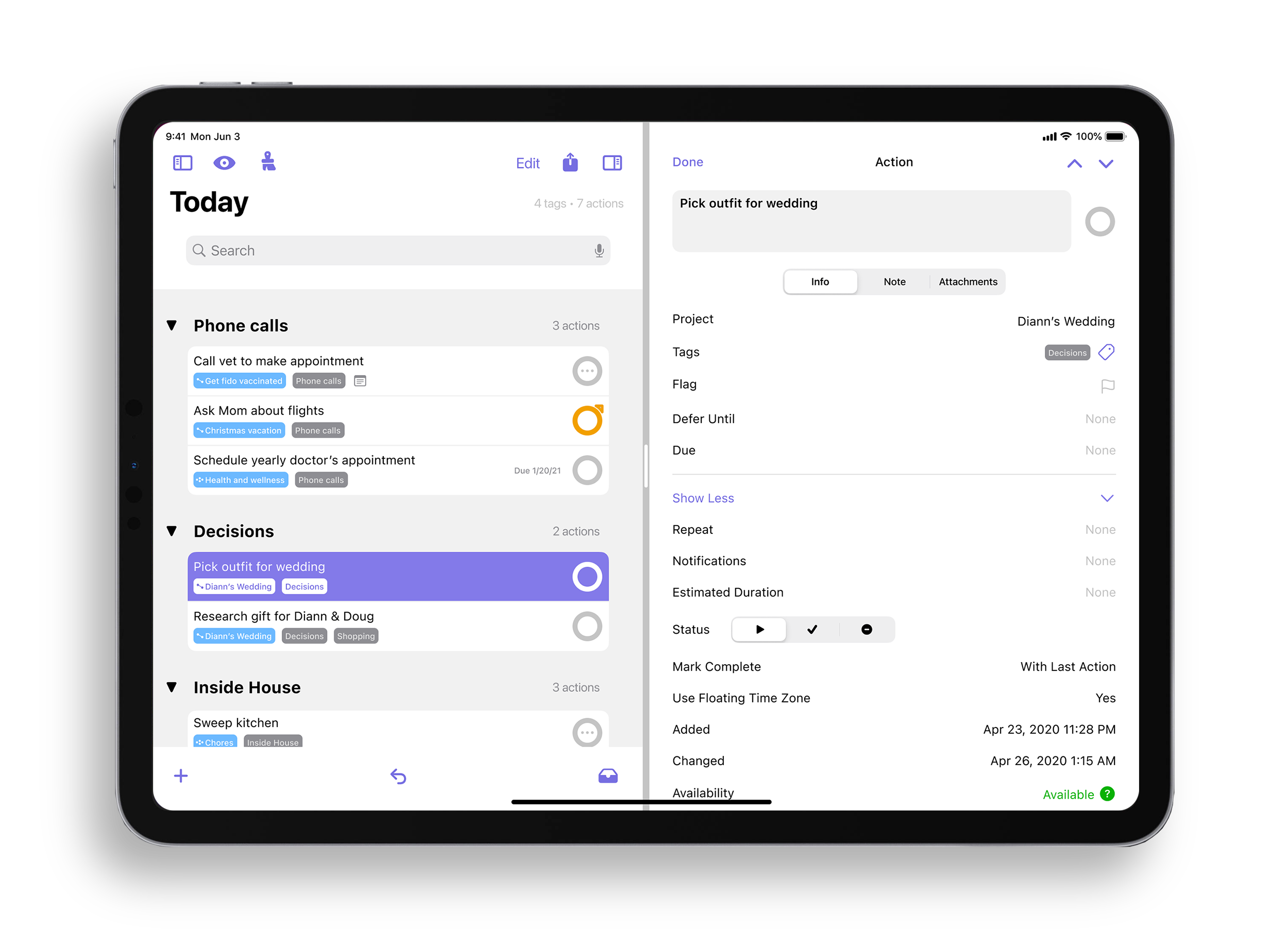
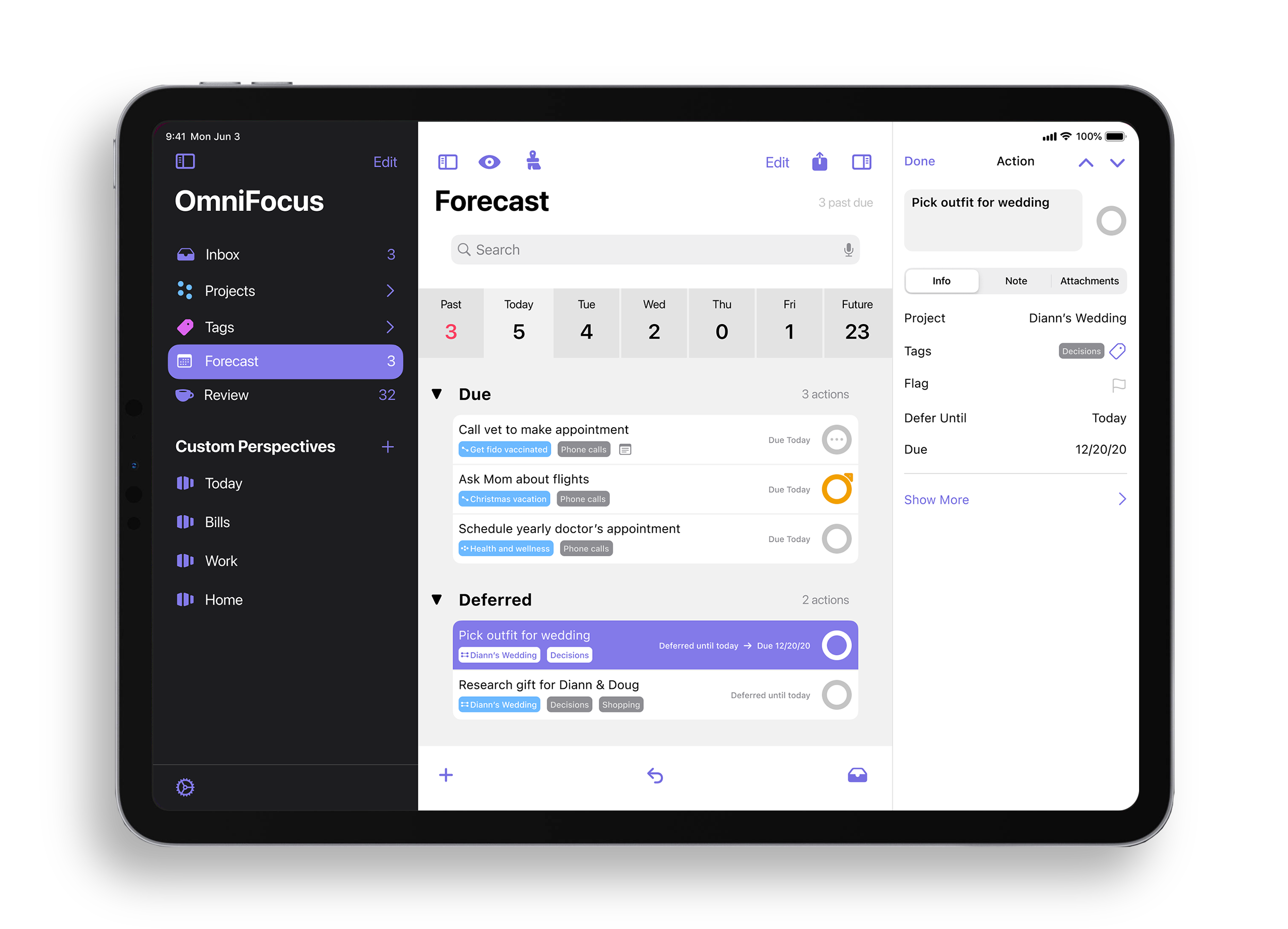
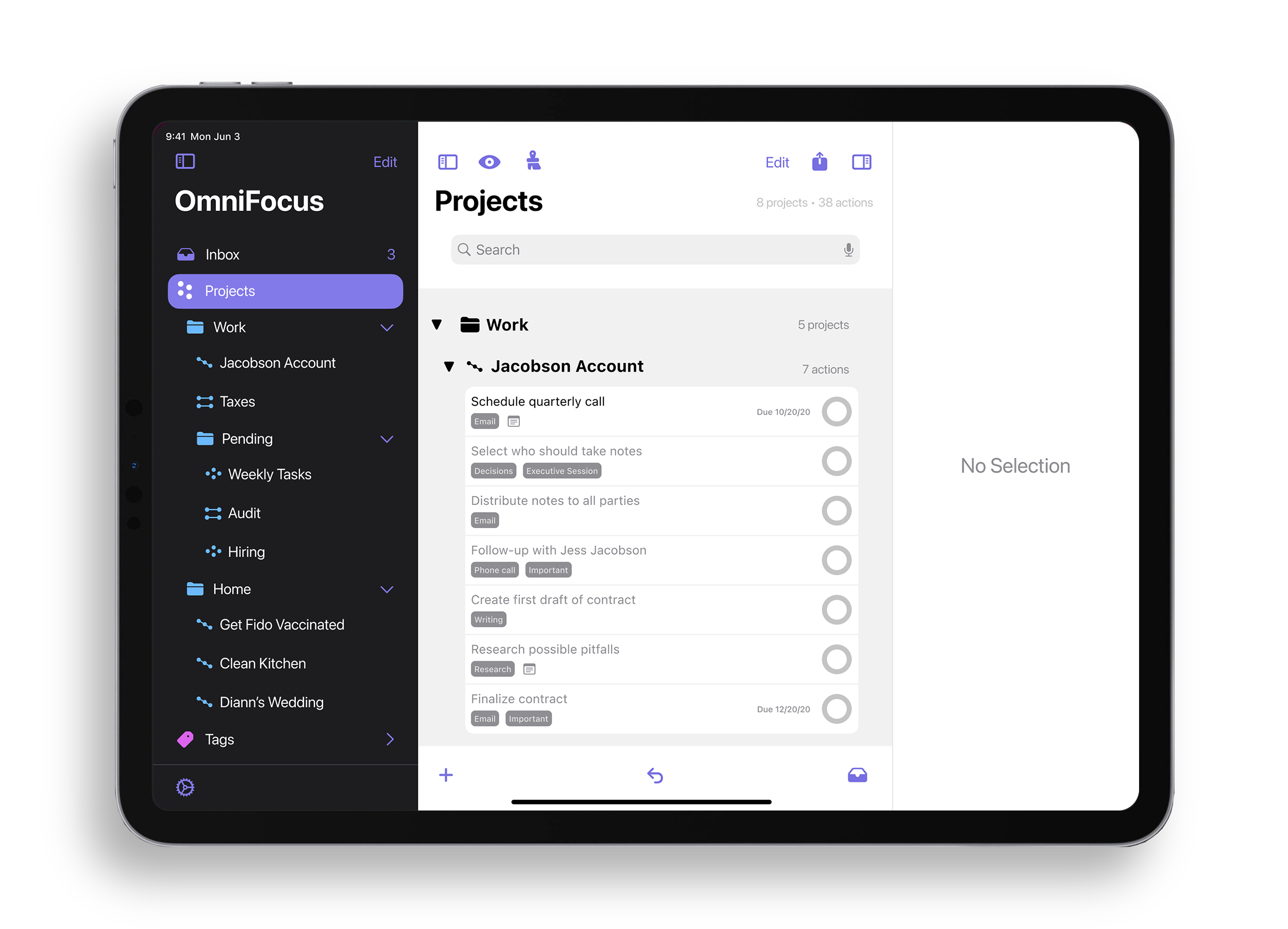
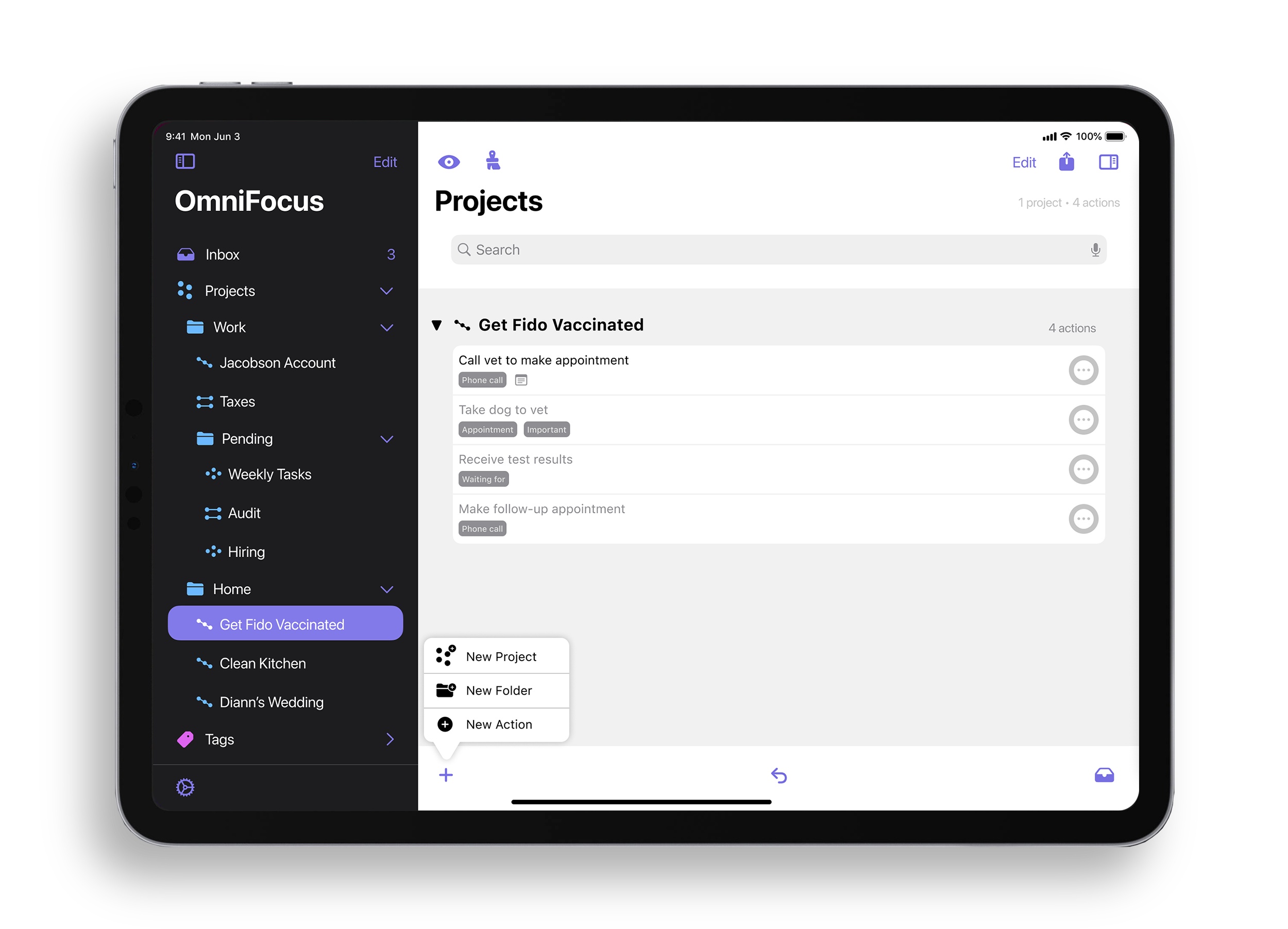
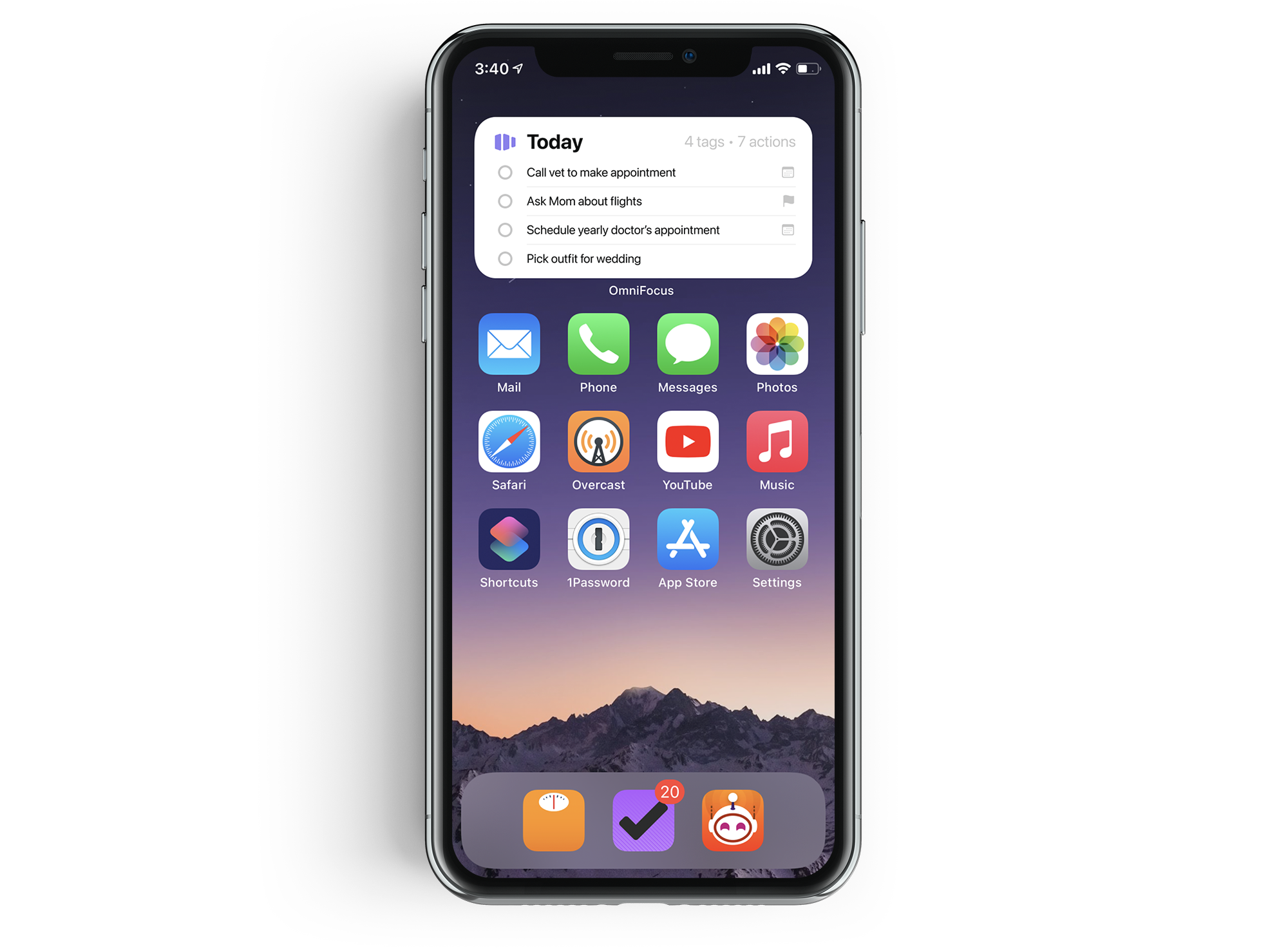
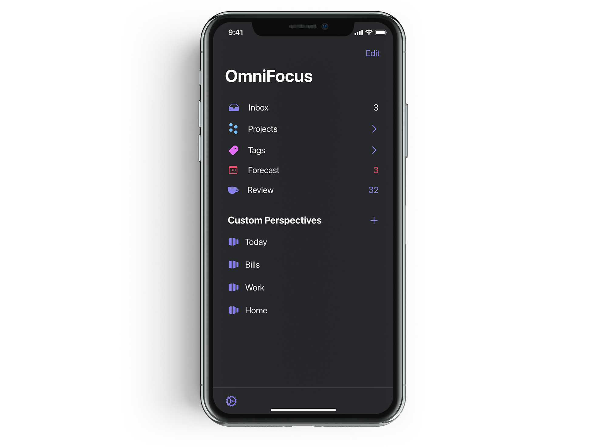
Perhaps Omni's most popular product is OmniFocus – a rich suite of task manager applications for macOS, iOS, iPadOS and web. Originally designed around the Getting Things Done methodology, and now on its third major version, OmniFocus has grown to be one of the most feature-rich task managers on any platform – far surpassing the common, but inadequate title of a to-do list.

Screen Shot 2020-10-03 at 4.51.11 PM.png
macos-big-sur-apple-layers-fluidic-colorful-wwdc-stock-2020-4096x2304-1455.jpg

As an OmniFocus fan for nearly a decade I can sympathize with the strong opinions that grow out of being a heavy user of something. It’s easy to develop a sense of entitlement when you use a tool for so long. You start to have ideas for new features – features that would, of course, suit you. And you feel that somehow you understand the tool better than other people, including the developers themselves. This is, of course, nonsense.

But occasionally trends appear in the cacophonous feature request threads on Omni's Forums. And to Omni's credit: they seem to listen. Whether it's multiple contexts (now tags), batch editing on iOS, floating time zone support (likely thanks to CGP Grey), or collaborative tasks (soon? please?) – all of these started as user requests.

But lately there has been a growing demand for the company to rethink the user experience and interface of OmniFocus. As popular competitors like Things win acclaim for their clean, modern appearance, OmniFocus – for all of its power – appears stuck in another time period. So I wanted to see what it might take to re-imagine the OmniFocus suite of apps. The answer, it turns out, is not so simple.

Goals

  • Design a consistent UX that scales from iOS, to iPadOS, to macOS. Currently there is a significant gap between the user experience on iPhone and iPad when compared to Mac. I want to narrow that gap.

  • Employ best practices from Apple's Human Interface Guidelines for each platform, while maintaining consistency and keeping the Omni brand in mind. The goal is not strictly to design the "Big Sur" or "iOS 14" versions of OmniFocus.

  • Don't just make it look like Things.

  • Explore opportunities for improving the user flow where possible. While my primary focus is not on features of the app, there are a few areas I wanted to contribute to.

  • Create an opinionated design. As mentioned above, The Omni Group has a track record of listening to its users and often implementing features, or providing options wherever possible. I feel this is a double-edged sword. On the one hand, it's wonderful as a user to be able to tweak the program to look and behave how I like. On the other hand, I think Omni is leaving some opportunities on the table to create strong stances on how the program ought to be used. My designs take the latter approach – but I recognize that's not necessarily going to be popular.

  • Focus on the iPad. I think the current iPad app has the most potential for improvement – as it shares its user interface with the iPhone, rather than the Mac. The trends for iPadOS apps are starting to shift to adopting more Mac-like experiences.

Challenges

OmniFocus is a massive app. The data model is big, and highly flexible. The variety of information that a user can enter is infinite. Designing frameworks around this level of flexibility is very difficult.

The current OmniFocus Pro 3 on iPhone, iPad, and Mac

The current OmniFocus Pro 3 on iPhone, iPad, and Mac

The product does not exist in a programming or design vacuum. It shares UI and UX paradigms, private APIs, and more with its sibling programs OmniPlan, OmniGraffle, and OmniOutliner. It's easy to draw pictures. It's hard to create a system. While I've tried not to deviate from the Omni "house" approach too much, I'm sure there are elements of my designs that would simply not work with the rest of their applications.

The Current Apps

Inbox in the current OmniFocus Pro 3 for macOS

Inbox in the current OmniFocus Pro 3 for macOS

macOS

The Mac version of OmniFocus is the most complete and powerful. It leverages both The Omni Group's long history of writing top-notch desktop applications and the Mac's ability to display large, sprawling UIs and menu systems. There's not much functionally that needs addressing, just maybe some housekeeping. The Mac version just suffers in how different it looks and behaves from the iOS/iPadOS version. Yes, the Mac was first, but I think the app needs to meet the other platforms halfway. The lack of consistency across platforms adds a lot of cognitive load to using the app on multiple devices. This is a problem for an app whose central tenets are avoiding distraction and encouraging productivity.

Inbox in the current OmniFocus Pro 3 for iOS

Inbox in the current OmniFocus Pro 3 for iOS

iOS

The iPhone experience falls short due to some legacy decisions from the early days of the platform, when smaller screens ruled the market. From the navigation (addressed in more detail below), to the UX for moving and organizing actions and projects (which has some of the most convoluted iconography imaginable), using OmniFocus on the iPhone feels like a consolation prize rather than a first class experience.

Inbox in the current OmniFocus Pro 3 for iPadOS

Inbox in the current OmniFocus Pro 3 for iPadOS

iPadOS

As mentioned in my introduction above, I think this is the one that hurts the most. Sharing a common UI with the iPhone, rather than leaning into the larger canvas offered by the iPad, is a missed opportunity. Most of the problems present on the iPhone exist on the iPad. Some are alleviated thanks to Omni's great support for iPadOS features like drag-and-drop, and multi-window. But in a world where iPadOS is feeling more and more like macOS, I see no reason why this version can't look and behave like its big brother.

Web

I don't use the web version, but from what I've read and seen Omni is choosing to follow its macOS design language. I've also read that the web version is still severely lacking in features, so I won't bother to critique an incomplete product. Suffice to say, I think it should continue to follow the macOS version wherever possible.

Proposal


of.family.prop.jpg

(Don’t worry, tons of screenshots and painfully long descriptions are below.)

Part One: Navigation

This is perhaps where the widest gap between iOS/iPadOS and macOS exists. Each platform has a unique navigation interface, which have almost nothing in common with each other. On the Mac, the far left of the OmniFocus window has a customizable tab bar. This tab bar takes you between the Inbox, Projects, Tags, Forecast, Review, Flagged, and Custom Perspectives. Selecting one of those will present a secondary sidebar to the right of the tab bar containing different hierarchies of data.

Main window in the current OmniFocus Pro 3 for Mac

Main window in the current OmniFocus Pro 3 for Mac

Home in the current OmniFocus Pro 3 for iOS/iPadOS

Home in the current OmniFocus Pro 3 for iOS/iPadOS

On iOS/iPadOS, the tab bar is replaced with a customizable tile dashboard, with each tile representing either a core area of the app, or a custom perspective. Tapping into one of these tiles will either display the perspective, or possibly send you down a deep rabbit hole of navigation. It's this navigation approach, combined with the fact that the iPadOS version of OmniFocus doesn't tell you what perspective you're viewing, that inspired me to make this design study. It is literally impossible to tell what perspective you are viewing on the iPad in the current release.

Proposed Main Menu redesign on iOS

Proposed Main Menu redesign on iOS

My proposed design replaces both navigational approaches with a standard hierarchical sidebar – similar to what you would find in many first-party Apple apps. Core areas of the app would be present at the top, while custom perspectives would be below. The bar could be customized to either rearrange or hide sections as desired.

Proposed sidebar with expanded project hierarchy on iPadOS

Proposed sidebar with expanded project hierarchy on iPadOS

Long nested lists, like those often found in the Projects section, could be navigated easily with small indents for each level. This is similar to how projects can be navigated today on macOS, and would be a huge improvement to the current iOS/iPadOS approach. Persistent sidebar highlighting, as well as title bars in the main body of the app would provide consistent orientation to the user.

Proposed sidebar with expanded project hierarchy on macOS

Proposed sidebar with expanded project hierarchy on macOS

 
macos-big-sur-apple-layers-fluidic-colorful-wwdc-stock-2020-4096x2304-1455.jpg

Part Two: The Task List

If you broke OmniFocus down to its atomic elements, an individual action – represented by a single row – would be the electron. And OmniFocus asks a lot of these small, but important building blocks. They display a lot of pertinent data. How these rows look, behave, and relate to each other could be infinitely debated.

Custom perspective in the current OmniFocus Pro 3 for macOS

Custom perspective in the current OmniFocus Pro 3 for macOS

OmniFocus currently offers two different display styles for rows: Fluid and Columns. Fluid nests information around the action title at the expense of vertical spacing and task density. Columns behaves more like the Finder in list view, distributing metadata across (invisible, un-adjustable) columns, allowing for a tighter display of tasks. Column view is only available on the Mac, with some variation of Fluid being used on iOS/iPadOS.

Proposed custom perspective for macOS

Proposed custom perspective for macOS

While I'm sure this would be controversial, I think this is an area where Omni can be a little more opinionated. I think settling on Fluid as a core design feature of the app has more upsides than down. And I say this as someone who does occasionally use Column view on the Mac.

Proposed custom perspective in iPadOS. Note the highlighting in the sidebar, and the perspective title (“Today”) in the main body. Both missing from the current release.

Proposed custom perspective in iPadOS. Note the highlighting in the sidebar, and the perspective title (“Today”) in the main body. Both missing from the current release.

Even though the existing Fluid appearance is a solid starting point, I still think there's room for improvement. As a few examples: I’ve increased padding, made project and tag capsules clearer, and on iPadOS and macOS, used inset grouped table views to allow tasks that share either common projects or tags to more easily stand out. Object alignments were another area I focused on improving, both in the task list, and throughout the rest of the app.


bg.maker [f0348](1).jpg

Part Three: The Inspector

The early versions of Mac OS X retained a lot of design elements from NeXTSTEP; one of those elements being inspector pallets. Used as a catch-all destination for controls and information, inspectors were really popular with productivity and utility applications in the early days of Mac OS X.

Even as their popularity among third parties has waned, you can still find them all over the place, though over time many of them have migrated into sidebars rather than floating pallets. Omni, like any good NeXTSTEP developer, has frequently leaned on inspectors as a core part of their UIs...and I think it works really well for the type of programs they make. But putting that many controls in a small area is a really difficult task. It's especially challenging when those controls also need to be translated to iOS/iPadOS.

OmniFocus' action inspector on macOS really shows its age. It stacks labels above controls, groups dissimilar datatypes, and behaves in a very different manner than its counterpart on iOS/iPadOS. The result is a very narrow field filled many different types of controls. There is some attempt at grouping similar fields, but it quickly falls apart. For example, under "Action" you can edit the Status, Project affiliation, and Flag (which is unlabeled – unless you hover for the tooltip). Or there's a collapsible section for "Dates", but a separate one for "Repeat". If things are going to be grouped, wouldn't "Repeat" fit with "Dates"? Instead of acting as an organizational mechanism, these groupings seem to just act as a rough way of allowing them to be collapsed.

The very tall Action inspector in the current OmniFocus 3 for macOS

The very tall Action inspector in the current OmniFocus 3 for macOS

A while back Omni made some adjustments to their iOS/iPadOS inspector designs to make use of progressive disclosure - the idea that options should only be revealed once they are made available by some other control – which helped immensely to clean up the sprawling sea of controls. They also allowed for fine-grain customization of the inspector, so fields could be re-ordered or even hidden. As a result I feel Omni's solution on iOS/iPadOS is more elegant than what they have on the Mac.

Proposed inspectors for iOS/iPadOS (left) and macOS (right)

Proposed inspectors for iOS/iPadOS (left) and macOS (right)

So, using the existing iOS/iPadOS inspector as a starting point, I redesigned each section while trying to maintain quick access to the controls that most users need. My main intention with the adjustments was to keep most default controls and their labels on the same row, expanding when necessary. I believe as a result that the layout is simpler to decipher at a glance. I also believe the inspector on iPadOS and macOS should be re-sizable. This would allow for some interesting opportunities for users who find themselves editing a lot of tasks, like during a review.

Proposed re-sizable inspector on iPadOS

Proposed re-sizable inspector on iPadOS


bg.maker [f0545](1).jpg

Part Four: Data Entry

On iPad and iPhone, entering new tasks summons a blank inspector. I think this is still probably the right solution for those devices. The Mac allows for more nuanced in-line editing of tasks.

Try as one might, it's still difficult to justify creating feature parity between all of the platforms that OmniFocus runs on. The Mac just offers much more flexibility than either the iPad or the iPhone. And while those latter two platforms are catching up in amazing ways, I'm still not sure it's fair to expect an app as massive as OmniFocus to do everything everywhere.

On the Mac, OmniFocus has - for as long as I can remember – had a great universally-available quick entry window. Summoning this window from anywhere within macOS is a crucial part of the idea capture process. While I did take some time to adjust this window's appearance, I was far more excited about how it could evolve by using natural language processing – similar to what can be found in other task managers, or apps like Fantastical.

Quick Entry.png
Smart Entry.png
macos.blurred.jpg

I’ve imagined a smaller, simpler window – not unlike Alfred – that can accept either natural conversational input or – as Fantastical supports – custom text commands to set certain options. Rather than having to tab through fields to set project, tags, dates or a flag, you could simply keep typing to set those values. In the example above, typing /d would be followed by a defer date, /t would associate existing tags, /p projects, and /f for setting a flag.

All this being said, it's really easy to design a UI for a pretend feature. It's hard to actually make said feature. This is just the one area I wanted to contribute a functionality concept rather than strictly a visual one.

Part Five: Pitfalls & Omissions

The information density of my designs is much lower than what OmniFocus offers today. I struggled a lot with how far to take the margins and padding, and while I believe I struck a good middle ground, I'm certain some would disapprove of the result. But I don't think scrolling should be such a feared interaction, especially when we can offer a clearer, more legible grid system in exchange.

The current apps allow one to display a project's full path within the OmniFocus database. Since I chose to move the associated project into a capsule next to the tags, this feature becomes problematic. It could be a particularly bad regression for people who have projects with the same or similar names across folders.

It’s at this point that I’d like to acknowledge that dark mode exists. Yes, I think it’s an important feature. No, it’s not reflected in any of my mock-ups. This is an area I think Omni already does a good job.

Conclusion

As I mentioned above, OmniFocus is a very large app. The designs I've presented here only touch a small percentage of the whole app. But I hope it can inspire discussion around not just what OmniFocus' future can be, but how developers can treat the UX and UI of multi-platform apps moving forward. As we enter the age of SwiftUI, Catalyst, and Apple Silicon Macs, it seems inevitable that apps developed for macOS, iPadOS, and iOS will demand additional attention to remain competitive.